 [Last fall I discussed my reservations about The Waters of Our Time by photographer Thomas Roma and his son Giancarlo T. Roma, a writer and musician. The Romas’ book replicates exactly the design, layout style, typography, and even paper of the 1955 Roy DeCarava and Langston Hughes classic, The Sweet Flypaper of Life, presenting itself as a tribute and companion piece thereto.
As a follow-up to my consideration of that project I dug out these prepared remarks that I delivered at the panel “A Radical Vision: Roy DeCarava’s ‘The Sweet Flypaper of Life,'” which took place at The Great Hall of The Cooper Union for the Advancement of Science and Art in New York City on the evening of October 29, 2018.
 Held in honor of the republication in facsimile of this classic book and the then-upcoming centennial of DeCarava’s birth, the panel was moderated by Thelma Golden, director and chief curator of The Studio Museum in Harlem. In addition to myself, panelists included Radiclani Clytus, independent filmmaker; Leslie Hewitt, Assistant Professor at The Cooper Union School of Art; John Stauffer, the Sumner R. and Marshall S. Kates Professor of English and African & African American Studies at Harvard; and photographer Hope Wurmfeld.
As preparation for the event, the moderator asked all the panelists to choose one image from the book and respond to it at length; hence the first part of my commentary. I thought some backstory related to the publishing of the book would provide useful context in this situation; hence the second part.
Click here for details of the event, and here for a complete video of the panel.— A.D.C.]
•
Some Thoughts on Roy DeCarava and Langston Hughes’s The Sweet Flypaper of Life
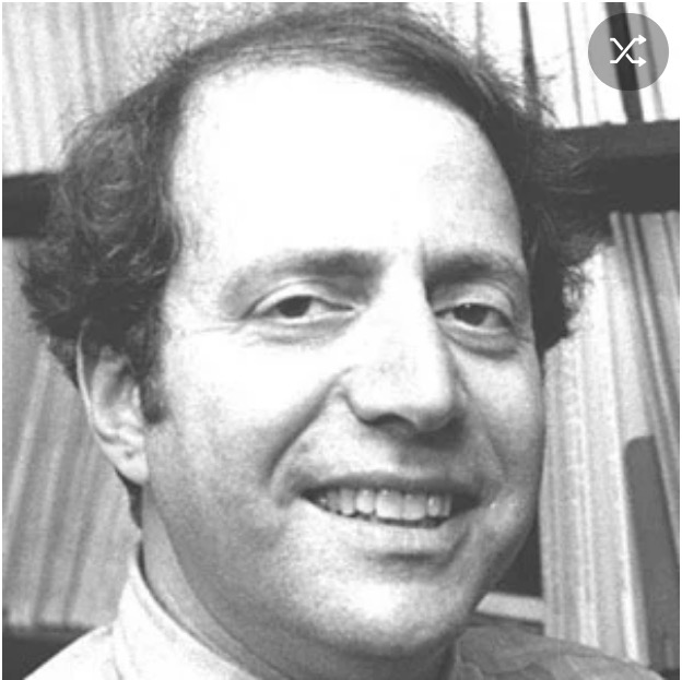
by A. D. Coleman
On the book’s concluding photograph, “Sister Mary Bradley”:
At the party celebrating this fine new edition of Sweet Flypaper a few weeks ago, Sherry Turner DeCarava made a point of thanking “Sister Mary Bradley,” the narrative voice binding together these photographs by Roy DeCarava.
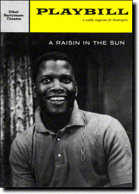
“A Raisin in the Sun,” Playbill, June 1959, cover
Let me remind you that four years after the publication of Sweet Flypaper, in 1959, A Raisin in the Sun, the play by Lorraine Hansberry whose title comes from the poem “Harlem” by Langston Hughes, debuted on Broadway. I suspect that Hansberry knew Sweet Flypaper, not just because she clearly knew and loved the work of Hughes but because the two projects resonate with and amplify each other.
Some of you may remember this story: During rehearsals for A Raisin in the Sun — with its almost entirely black cast, its black director, and its black playwright — everyone involved, from the producers on down, had no idea who would come to a Broadway theater to watch a play about African-American working-class travails. It seemed entirely possible that the play would flop, would close on its opening night.
Lloyd Richards, the director, later recalled an experience he had watching audience members buy their tickets at the box office during the first days of its run. He asked a black woman complaining about the ticket price why she was still purchasing it. She replied “The word’s out in my neighborhood that something’s going on down here that concerns me, so I had to come down here to find out what it was about.” And, indeed, black people — including many who had never set foot in a Broadway theater before — contributed substantially to the play’s survival in its first months and thereafter.
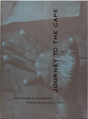
Sid Grossman, Journey to the Cape (1959), cover
Something was also going on in Roy DeCarava’s early photographs that concerned that woman, and many others like her — the Sister Mary Bradleys of the world, not all of them by any means black. But I don’t think it was as immediately apparent to them as was the significance of Hansberry’s work — because, unlike mainstream theater, hardly anyone took photography seriously at the time. The idea that a photograph could function not just denotatively but connotatively — that it could go beyond documentation to constitute a form of personal poetry — had not really seeped into public consciousness.
Moreover, the understanding that a sequence of photographs made with a poet’s sensibility and intent could become more than the sum of its parts, could achieve the status of literature, was new and challenging even within the world of photography. The Fifties saw a number of such projects — Sid Grossman’s Journey to the Cape, most notably Robert Frank’s The Americans; none found much of an audience. Only W. Eugene Smith’s astonishing essays for Life magazine succeeded in this vein, in no small part because he embedded those images in narrative structures with his own distinctive prose voice telling those stories.
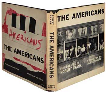
Robert Frank, “The Americans,” first U.S. edition, 1959.
So DeCarava’s work needed someone to contextualize it for the audience, a spokesperson known to and respected by that community. That was Langston Hughes’s genius as editor and sequencer and voiceover for this book. And I would propose that what he achieved therein, though radically different in kind, constitutes an editorial accomplishment that bears comparison with what Robert Frank did with his own pictures in The Americans, published in 1958-59. To use a distinction from general systems theory, Hughes took a heap and made of it a whole.
And the key device by which he realized this goal was the invention of “Sister Mary Bradley,” whose persona gave shape and coherence to Roy’s disorganized box of photographs. This is the intimate voice of someone going through a family album, or a shoebox full of family pictures, and captioning them for a friendly visitor. It’s a female voice, and a strong voice, befitting the work of two men who, in their different ways, were clearly in touch with what Jung would have called their feminine aspects.
As a first-time reader, you engage with that voice as you move through the book, and inevitably form some vague image of the speaker, without anything to flesh that picture out. Brilliantly, Hughes positions that defining image — in most regards an utterly conventional street portrait of a smiling, confident, elderly black woman posing in her Sunday best — at the book’s very conclusion, where it comes as both a total surprise and an absolute inevitability. Among its core aspects, photography particularizes; Hughes holds off until this moment to reveal the visual identity of this particular woman. And when at last you see her, you think: Of course that’s who’s told you this story, with all her gravity and humor and grace. You recognize her immediately, you knew it was her all along.
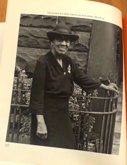
Roy DeCarava, Sister Mary Bradley, Sweet Flypaper of Life (1955)
•
Publishing context:
In 1955 Langston Hughes had some clout at Simon & Schuster. Two volumes of his “Simple” stories, which began as columns for the Chicago Defender, had appeared under that imprint: Simple Speaks His Mind (1950) and Simple Takes a Wife (1953), to critical acclaim and successful sales — finding a crossover market.
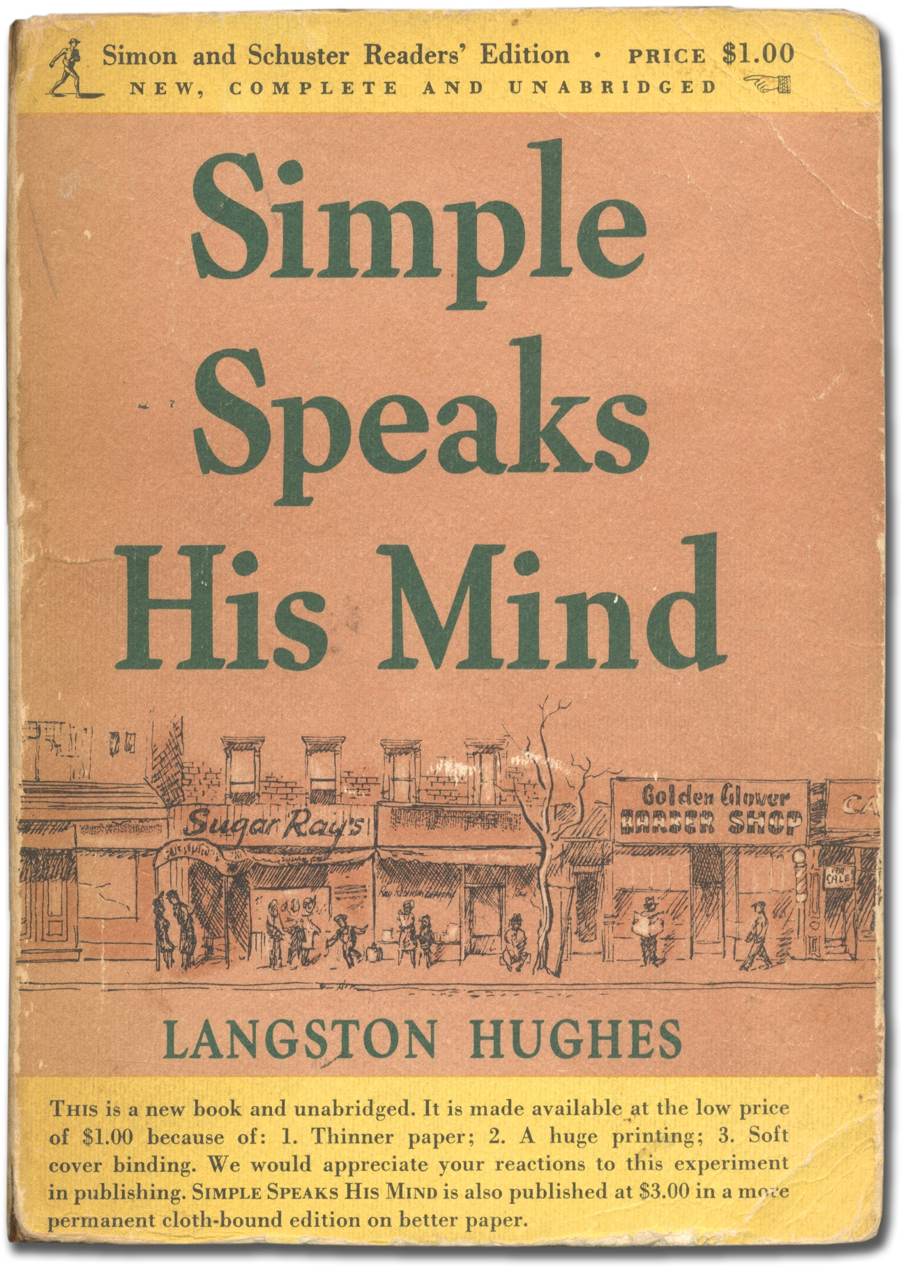
Langston Hughes, Simple Speaks His Mind (1950), cover
But Richard Simon of that publishing house wouldn’t have needed much arm-twisting. An avid amateur photographer himself, father of singer-songwriter Carly, composer Lucy, and Peter (who would become a photographer in his own right), Richard (1899-1960) had corresponded at length with the influential, controversial pictorialist photographer William Mortensen, and had been primarily responsible for the only book of Mortensen’s ever issued by a major publishing house, Mortensen on the Negative (1940). So he knew the medium well, and had a taste for offbeat photo projects.
Perhaps more importantly, earlier that year Simon & Schuster had partnered with the book packager Ridge Press to issue the catalog of Edward Steichen’s blockbuster group show The Family of Man in multiple editions and formats. Already a best-seller, that book showed the wide appeal to the general audience of books of photographs with a liberal-humanist bent. And the volume of its sales, and the profits therefrom, meant that S&S could afford to back an unlikely project like Sweet Flypaper, most likely as a labor of love on Simon’s part.
•
A word about the book’s production values. Sweet Flypaper came out before the era of the “quality paperback” from major publishing houses. [Addendum: In 1939 Simon & Schuster had founded the S&S offshoot Pocket Books, the first imprint devoted exclusively to paperbacks. — A.D.C.] Paperback books at the time were mostly standard in their design and format, printed on cheap wood-pulp paper — one grade up from newsprint — to keep prices down, intended for one-time reading. Sweet Flypaper went in a different direction. It’s too bad we don’t know the designer’s name, because it has a distinctive, arresting design: We immediately make eye contact with a black girlchild peeping up at us, with the opening words of Hughes’s monologue getting us instantly involved. Whoever designed this book did so with love.
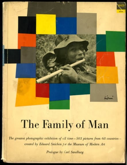
Edward Steichen, “The Family of Man” (1955), cover
This looks like no other Simon & Schuster paperback cover of the period. Indeed it doesn’t even fit either of the standard paperback formats of the period — it’s wider than both. If it resembles anything else, it’s the small-edition paperback books of experimental poetry and prose — Allen Ginsberg’s Howl among them — published by poet Lawrence Ferlinghetti’s City Lights bookstore in San Francisco around the same time.
And it’s printed on a much higher-quality paper than most commercial paperbacks at the time — matte surface, thicker, and with a considerable rag content, as a result of which surviving copies show minimal yellowing. Plus a cover of a comparable stock, with a slightly pebbled surface, so that it feels comfortable and soft in the hand. All of it printed by sheet-fed gravure, so the ink seeps into the papers and yields a much deeper darkness than single-run halftone could. Compared to the equivalent paperback edition of The Family of Man, it’s several levels of production value higher. And priced at a dollar, which seems like nothing today but was more than most paperbacks cost back then. On all counts, this book got made on the assumption that anyone who bought it would want to keep it, so it was made to last — as it has.
Richard Simon, ca. 1955; photographer unknown
As with A Raisin in the Sun, no one involved with the publication of this book could have had any idea who would form its audience, nor whether it would even find an audience, enough at least to cover its production costs. It could easily have sunk like a stone, losing money. I don’t know how well it sold in those editions; perhaps we’ll find out this evening. But the fact that it did get published, in this quietly elegant yet financially accessible form, means that someone at the very top at the publishing house believed in it sufficiently to risk a bundle on making it happen, and did so as a labor of love.
So, as we pay tribute tonight to Roy DeCarava for these remarkable images, and to Langston Hughes for his editorial and authorial contributions, and to the still anonymous designer who melded them together with such loving, unobtrusive craft, let us not forget to give thanks to Richard Simon, whose commitment to photography, and to this germinal work, midwifed it into the world.
•
This post sponsored in part by a donation from Susana Toruela Leval.
•
 Special offer: If you want me to either continue pursuing a particular subject or give you a break and (for one post) write on a topic — my choice — other than the current main story, make a donation of $50 via the PayPal widget below, indicating your preference in a note accompanying your donation. I’ll credit you as that new post’s sponsor, and link to a website of your choosing.
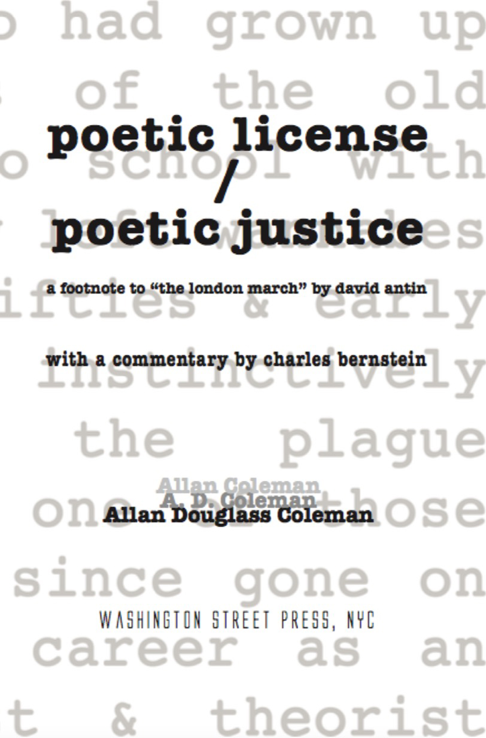
And, as a bonus, I’ll send you a signed copy of my new book, poetic license / poetic justice — published under my full name, Allan Douglass Coleman, which I use for my creative writing.
[donateplus]

To the degree that Frank journeyed out, DeCarava journeyed in. Frank’s attention was centrifugal, DeCarava’s centripetal.
What an intriguing way to put it!
Thanks for writing this, Allan.
As is little-known, DeCarava’s 1952 Guggenheim and Frank’s 1955 and 1956 Guggenheims were all the judgment of Walker Evans, then the secret referee for the Foundation. As is well-known, Evans was also one of Frank’s five recommenders. I don’t know who recommended DeCarava, but boy-oh-boy am I ever grateful.
My guess would make it Steichen who recommended DeCarava for the Guggenheim. Steichen had already included him in a group show in a MoMA series titled “Always the Young Stranger” (his version of today’s “New Photography” series), and had also included several of his images in “The Family of Man.” And while Evans was, as you put it, the “secret referee” for the Guggenheim fellowships, they were then — and have remained since — umbilically connected to the Museum of Modern Art, though only in their photography picks.
I flutter around a bit, flirting with this or that, but always return to the text+pictures as my favorite form for photos. Somehow, text offering one flow, and photographs a related flow operating in a kind of counterpoint feels most natural and good as a home for photography, to this reader.